Customize TE’s appearance using CSS
This add-on is for advanced users.
user.css
| Selector | Effect |
|---|---|
.tab, .tab1, .tab# |
Tabs |
.activetab |
Active tab |
.breadcrumb, |
Breadcrumb bar both standalone and Inner Breadcrumb |
.button |
Toolbar buttons (includes breadcrumbs clickable items) |
| `` | |
#MenuFavorites |
|
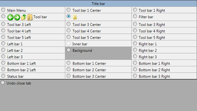
#toolbar |
Toolbar (See image below) |
#ToolBar1Left |
Main top toolbar (File, Edit View, Favorites Tools, Help menus) |
#ToolBar1Center |
Top toolbar centered (immediately right of File, Edit View, Favorites Tools, Help menus) |
#ToolBar1Right |
Top toolbar right (right aligned to File, Edit View, Favorites Tools, Help menus) |
#ToolBar1Left |
Toolbar (See image below) |
#ToolBar1Center |
Toolbar (See image below) |
#ToolBar1Right |
Toolbar (See image below) |
#ToolBar2Left |
Toolbar (See image below) |
#ToolBar2Center |
Toolbar (See image below) |
#ToolBar2Right |
Toolbar (See image below) |
#ToolBar3Left |
Toolbar (See image below) |
#ToolBar3Center |
Toolbar (See image below) |
#ToolBar3Right |
Toolbar (See image below) |
#ToolBar4Left |
Toolbar (See image below) |
#ToolBar4Center |
Toolbar (See image below) |
#ToolBar4Right |
Toolbar (See image below) |
#ToolBar5Left |
Toolbar (See image below) |
#ToolBar5Center |
Toolbar (See image below) |
#ToolBar5Right |
Toolbar (See image below) |
#client |
Toolbar (See image below) |
#leftbar |
Toolbar (See image below) |
#leftbarT |
Toolbar (See image below) |
#LeftBar1 |
Toolbar (See image below) |
#LeftBar2 |
Toolbar (See image below) |
#LeftBar3 |
Toolbar (See image below) |
#leftsplitter |
Toolbar (See image below) |
#Background |
Toolbar (See image below) |
#rightsplitter |
Toolbar (See image below) |
#rightbar |
Toolbar (See image below) |
#rightbarT |
Toolbar (See image below) |
#RightBar1 |
Toolbar (See image below) |
#RightBar2 |
Toolbar (See image below) |
#RightBar3 |
Toolbar (See image below) |
#bottombar |
Toolbar (See image below) |
#BottomBar1Left |
Toolbar (See image below) |
#BottomBar1Center |
Toolbar (See image below) |
#BottomBar1Right |
Toolbar (See image below) |
#BottomBar2Left |
Toolbar (See image below) |
#BottomBar2Center |
Toolbar (See image below) |
#BottomBar2Right |
Toolbar (See image below) |
#BottomBar3Left |
Toolbar (See image below) |
#BottomBar3Center |
Toolbar (See image below) |
#BottomBar3Right |
Toolbar (See image below) |
#Panel |
Toolbar (See image below) |
#None |
Toolbar (See image below) |
#Size |
Toolbar (See image below) |
#MenuFavorites { display: none; }Firefox like rounded tabs
Source (in Japanese): https://qiita.com/nocd5/items/af062f7b06d4cd3b8b18#%E5%A4%89%E6%9B%B4%E7%82%B9
.tab, .tab2, .tab3,
.tab:hover, .tab2:hover, .tab3:hover {
  box-shadow: none;
}

.tab0 {
  padding: 3px 0 0 12px;
  background-color: ActiveCaption;
}

.tab, .tab2, .tab3 {
  position: relative;
  background: transparent;
  border-width: 0 0.1px;
  border-style: solid;
  border-color: transparent;
  padding: 0 12px;
  opacity: 1 !important;
}

.activetab {
  position: relative;
  background-color: #fff;
  border-width: 0 0.1px;
  border-color: #fff;
  border-top-left-radius: 12px calc(2em - 12px);
  border-top-right-radius: 12px calc(2em - 12px);
  margin: 0;
  padding: 0 12px;
  height: 2em;
}

.activetab:before,
.activetab:after {
  content: "";
  position: absolute;
  bottom: 0;
  width: 12px;
  height: 12px;
  z-index: -1;
}
.activetab:before {
  left: 0;
  background-image: radial-gradient(
    farthest-side at top right,
    transparent 100%,
    #fff 100%
  );
  transform: scale(-1, 1);
  transform-origin: left;
}
.activetab:after {
  right: 0;
  background-image: radial-gradient(
    farthest-side at top left,
    transparent 100%,
    #fff 100%
  );
  transform: scale(-1, 1);
  transform-origin: right;
}

.tab:hover,
.tab2:hover {
  position: relative;
  border-width: 0 0.1px;
  border-style: solid;
  border-color: #d0e0e9;
  border-top-left-radius: 12px calc(2em - 12px);
  border-top-right-radius: 12px calc(2em - 12px);
  background-color: #d0e0e9;
  z-index:0 !important;
}

.tab:hover:before,
.tab:hover:after,
.tab2:hover:before,
.tab2:hover:after {
  content: "";
  position: absolute;
  bottom: 0;
  width: 12px;
  height: 12px;
  z-index: -1;
}
.tab:hover:before,
.tab2:hover:before {
  left: 0;
  background-image: radial-gradient(
    farthest-side at top right,
    transparent 100%,
    #d0e0e9 100%
  );
  transform: scale(-1, 1);
  transform-origin: left;
}
.tab:hover:after,
.tab2:hover:after {
  right: 0;
  background-image: radial-gradient(
    farthest-side at top left,
    transparent 100%,
    #d0e0e9 100%
  );
  transform: scale(-1, 1);
  transform-origin: right;
}
Chrome like slanted tabs
Source (in Japanese): https://qiita.com/nocd5/items/af062f7b06d4cd3b8b18#%E7%B5%90%E5%B1%80
.tab, .tab2, .tab3,
.tab:hover, .tab2:hover, .tab3:hover {
  box-shadow: none;
}

.tab0 {
  padding: 3px 0 0 12px;
  background-color: ActiveCaption;
}

.tab, .tab2, .tab3 {
  position: relative;
  background: transparent;
  border: 0;
  padding: 0 12px;
  opacity: 1;
}

.activetab {
  position: relative;
  background-color: #fff;
  border: 0;
  padding: 0 2px;
  margin: 0 10px;
  height: 2em;
}

.activetab:before,
.activetab:after {
  content: "";
  position: absolute;
  background-image: url("data:image/svg+xml;charset=utf8,%3Csvg%20xmlns%3D%22http%3A%2F%2Fwww.w3.org%2F2000%2Fsvg%22%3E%3Cpath%20fill%3D%22%23fff%22%20d%3D%22M24%200C9%200%2015%2024%200%2024h25V0h-1z%22%2F%3E%3C%2Fsvg%3E");
  bottom: 0;
  width: 25px;
  height: 24px;
}
.activetab:before {
  left: -24px;
}
.activetab:after {
  right: 1px;
  transform: scaleX(-1);
  transform-origin: right;
}

.tab:hover,
.tab2:hover,
.tab3:hover {
  position: relative;
  background-color: #d0e0e9;
  border: 0;
  padding: 0 2px;
  margin: 0 10px;
}

.tab:hover:before,
.tab:hover:after,
.tab2:hover:before,
.tab2:hover:after,
.tab3:hover:before,
.tab3:hover:after {
  content: "";
  position: absolute;
  background-image: url("data:image/svg+xml;charset=utf8,%3Csvg%20xmlns%3D%22http%3A%2F%2Fwww.w3.org%2F2000%2Fsvg%22%3E%3Cpath%20fill%3D%22%23d0e0e9%22%20d%3D%22M24%200C9%200%2015%2024%200%2024h25V0h-1z%22%2F%3E%3C%2Fsvg%3E");
  bottom: 0;
  width: 25px;
  height: 24px;
}
.tab:hover:before,
.tab2:hover:before,
.tab3:hover:before {
  left: -24px;
}
.tab:hover:after,
.tab2:hover:after,
.tab3:hover:after {
  right: 1px;
  transform: scaleX(-1);
  transform-origin: right;
}